
It’s a brand new year! And many investors are wondering what to expect from the real estate investing market in the next 365 days.
Today, I’m going to share something with you that will help you make SMART investing decisions in 2017.
You don’t have to invest blindly, and I don’t recommend basing your strategy solely on dated tropes like “buy low, sell high.” If you buy right (in the right location at the right time, using the right strategy), you’ll make money. And buying right involves understanding real estate cycles and patterns.
Imagine piling your family into your car in the middle of a cold, dark, rainy night then speeding down a twisting mountain road, never turning on your headlights, or buckling your seat belt.
You’d NEVER consider doing that, not even for a second; it’d be irresponsible and just plain crazy.
So why would you take the equivalent risk with your financial well-being?
It’s true that real estate can make you very wealthy.
It can also bankrupt you in a heartbeat; just ask any of the millions of people who invested blindfolded in their local markets and found themselves in foreclosure, bankruptcy or worse.
The good news is that real estate cycles are easy to master if you know how! It’s the market cycle that dictates if you win or lose, NOT the strategy itself.

The Data
But…who wants to study data and market cycles? Most of us (including myself…) don’t have the time or energy to dive deep into data.
The good news is that our friend Ken Wade, a C.P.A. with more than 20 years of real estate investing experience, found a solution that makes seeing market cycles MUCH easier. His software predicts market trends years in advance.
I’m going to share some insights about real estate market cycles and how it will affect you in 2017, but before I do, I need to explain how to understand what I’ll be showing you. There are two types of charts we’ll be looking at: The STAR and the TAPS charts.

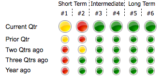
Momentum (STAR) Indicators
The STAR momentum indicators show the “energy” behind any market. A sustained up-cycle MUST be supported by momentum.
The first step in locating investment candidates is evaluating the STAR indicators.
The leftmost columns are Short-Term triggers and carry far less significance than the Long-Term indicators on the right.
However, all Trend Reversals (up or down) BEGIN with the short term triggers. They provide early-warning signals, especially when they develop a consistent pattern of changing colors (from green to red, or red to green) “growing” from left to right.
The color green indicates positive, upward sloping momentum. The color red means the opposite. The color yellow occurs when, in the current period, the slope/direction changed for that trigger.
Markets that do not display a consistent one-color pattern are generally lacking ANY momentum, and are poor investment markets for Leveraged Appreciation.
- Higher Scores (towards RED colors) indicate positive market momentum BUT do not necessarily signal an investable market.
- Low scores indicate a non-investable market.

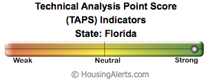
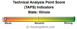
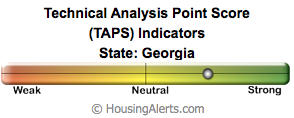
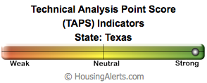
Technical Analysis (TAPS) Indicators
The TAPS (Technical Analysis Point Score) indicator is an easy to understand, graphical way to show the results of complex Technical Analysis (TA) “Studies.”
The simple “slider ball” can move a total of five notches starting from far left (Weak) to far right (Strong).
If the ball position has moved since the prior period, it will have a series of arrows behind it. If the arrows are on the left, that signifies a move from the left, from a weaker to a stronger position and vice-versa.
- Higher Scores (towards RED colors) indicate market strength.
- Low scores indicate flat, declining or otherwise crummy investment markets.
- The score is ranked against other investable markets.
Ready to See How it Works?
Below are a few examples of how the data translates into these charts, and how to interpret the charts.
BUT…to avoid making a major mistake in using these charts for your business, make sure to read all the way to the end.
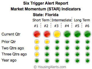
Florida
Like I mentioned above, the most important indicators are the long-term indicators on the right side of the STAR charts (the first chart in all of the sets from here on out).
Florida has positive momentum indicators for long-term investing, but short-term…not so much. That means that generally speaking in Florida, you’re going to have a much harder time making money with strategies like wholesaling or flipping houses.
That doesn’t mean that your local market in Florida couldn’t be very different from the state market. It’s important to look at your local market, and I’ll talk more about that later in this post.
The other thing you see in the chart below is that a *pattern* is starting to emerge (the green momentum seems to be fading into more yellow, and even some red). While it’s hard to see without comparing the last year to a few years prior, it looks like the strong market might be starting to weaken on a broader level.


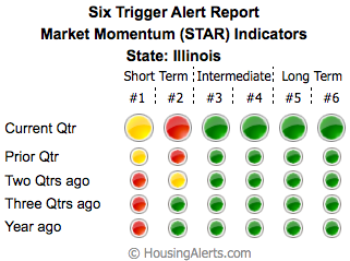
Illinois
Illinois is classified as a weaker market compared to Florida. Again, it’s hard to see without more context, but you can tell by the STAR chart below that the green/positive momentum appears randomly, not predictably. When the strength or weakness of market momentum is random, you can’t predict the reliability of an investment strategy, making the market weaker for investing than in more predictable markets.
As many of our MyHouseDeals members know, there’s definitely money to be made in Chicago, even though it’s located in Illinois. Again, I’ll talk more about local market examples below.

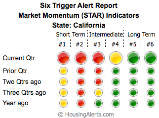
California
While the STAR chart below for the last year looks a little random, looking at it with a 5-year context shows a definite pattern of consistently increasing negative market indicators.


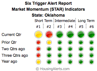
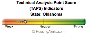
Oklahoma
Oklahoma’s STAR chart is all over the place, especially if you look at it with more context than below. So, even though there are lots of green indicators showing momentum, the randomness indicates that Oklahoma, overall, isn’t a reliably great place to invest.
The arrows you see on the TAPS chart show that there was recent improvement in the market indicators—a good sign for the months ahead.


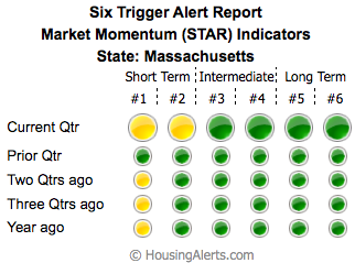
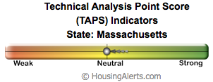
Massachusetts
Massachusetts has a lot of opportunities to profit in real estate! Even though some indicators are trending negatively in the last year (shown by the arrows on the TAPS chart), there are still many positive indicators.
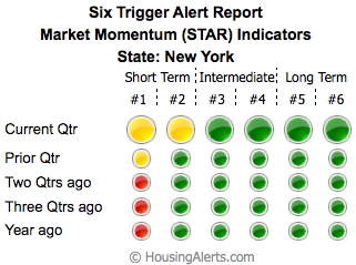
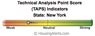
New York
New York’s market also has a lot of strong, positive indicators, but is trending down for the last year.
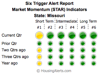
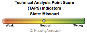
Missouri
Missouri has profitable indicators for both short-term and long-term investing, but is considered a neutral market because of its stability.


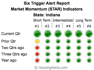
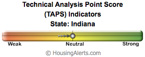
Indiana
Indiana is a neutral market overall with positive indicators for both short and long-term investing strategies, and some slowing momentum in the last year in the market overall, as indicated by the arrows on the TAPS chart.


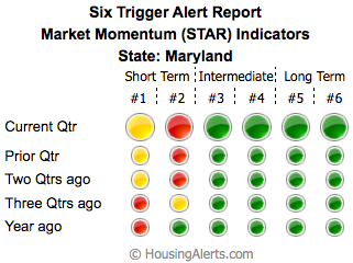
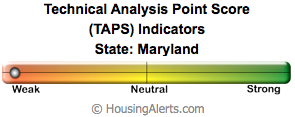
Maryland
Maryland is a weak market according to the TAPS, but if you’re strategies involve intermediate or long-term investments, you’re in good shape.

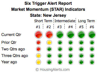
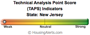
New Jersey
When looking at the last year of market indicators, New Jersey looks for very similar to Maryland. If you’re strategies involve intermediate or long-term investments, you’re in good shape.
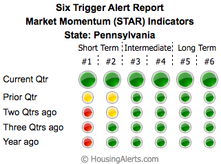
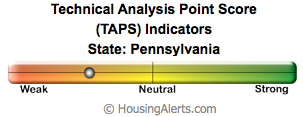
Pennsylvania
Pennsylvania has positive indicators for investment strategies, both long-term and short-term, but the market overall isn’t very strong. Keep in mind that your local market indicators and scores could be very different from the state’s overall score. And that’s where we get into the real kicker…
The Kicker
Remember how I said at the end of this post I would reveal how to avoid making a HUGE mistake reading these charts? Well, here is the kicker:
Real estate moves in cycles. So, while these charts provide a great start, looking at these charts alone has two limitations:
- You can’t see the cycle and accurately predict what is coming next without looking at a wider date range.
- Your local market can be very different from the state market. Georgia and Texas are two examples:
Georgia
Georgia, overall, has a strong market. There are good intermediate and long-term indicators, and even though short term indicators look like they are starting to form a pattern, the market is predictable and profitable overall for mid and long-term investing strategies.
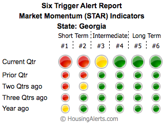


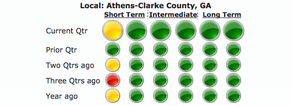
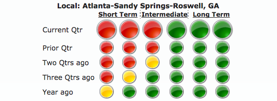
However, two local markets tell a different STAR story…
Athens County shows stronger indicators for short-term investing compared to Georgia as a whole, so you’re likely to profit from wholesale deals and flips in Athens.
Atlanta, however, shows a similar story to Georgia as a whole: A healthy market, but only if you’re in it for the long haul (hello rentals!) There are always exceptions, of course, and Atlanta is one of our top markets at MyHouseDeals.


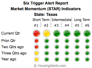
Texas
If you look at the chart below, you’ll see Texas has a strong market overall. Looking at the score shows you that Texas, overall, is a great pace to invest. It has rising prices and strong wealth indicators.
However, local markets can be very different than the state in which they are located. Abilene is a great example:
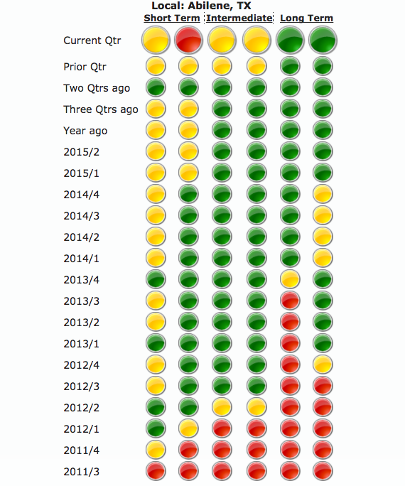

Looking at this 5-year history of Abilene’s STAR indicators…we see a different story. The market was strong for several years—lots of green across the board for the most part. However, the yellow and red are starting to trend in more recent years, and are creating a noticeable pattern. While investing in the long-term is still predictably profitable, the short and intermediate indicators are changing.
Now What?
Hopefully the information above gives you an overview of what is happening in the market.
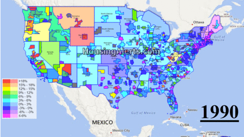
The best thing you can do for your real estate investing business this year is to find out as much as you can about your LOCAL market—and I highly recommend you take a look at Ken’s software, Housing Alerts, where you can drill down to city, state, regional or national-level data going back many years.
Watch his webinar to learn more about the market, and how his software can accelerate your business!